SPACE 2: KATE LAMBE
Exhibition dates. 21 JUNE - 2 JULY 2023
Opening Reception : Thursday 22 JUNE 2023, 6:00 - 8.30pm
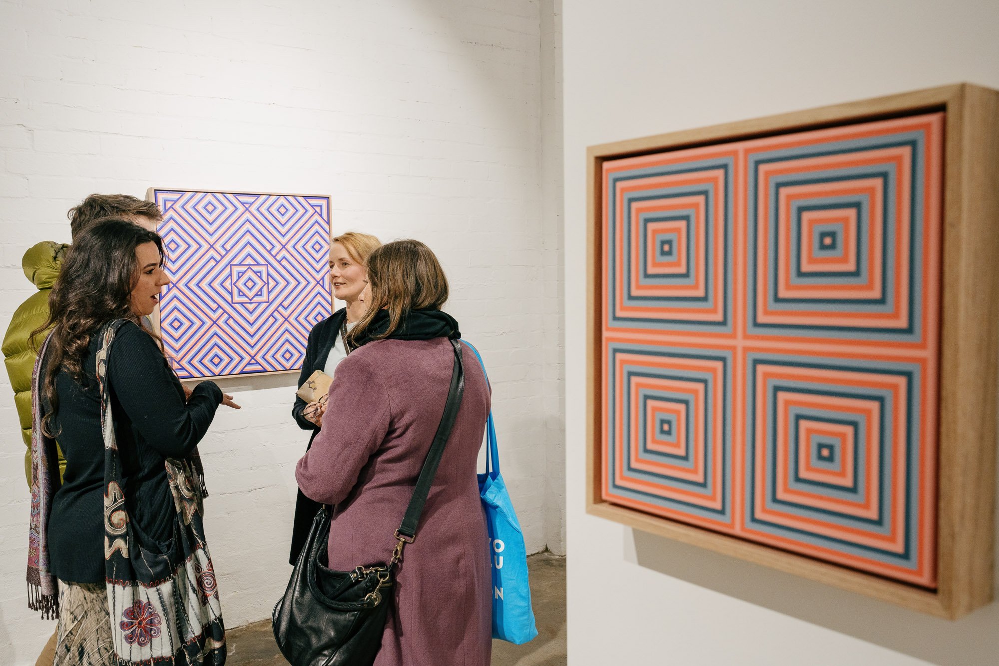
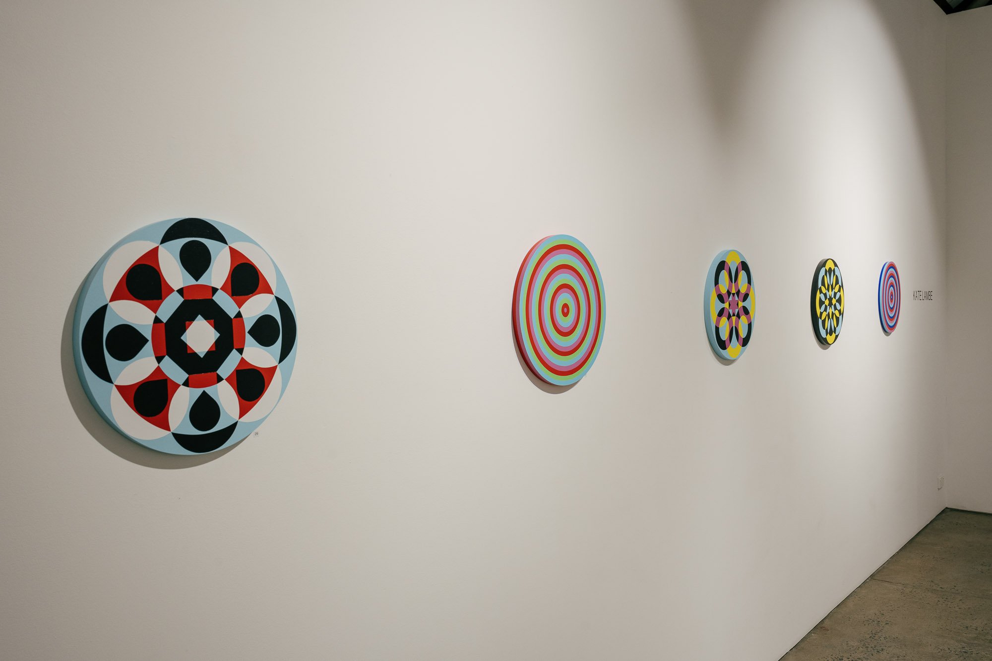
My art practice is strongly influenced by my graphic design background, and it generally encompasses lettering and symbols in an abstract manner that deliver a message. My designs begin on paper, are refined and resolved on computer, and are finally realised in acrylic paint in vibrant colours. I work in a very precise way, using a large variety of masking tapes to produce definitive, unambiguous lines that result in hard edge abstraction. The messages conveyed in each painting can be of personal, social or political capacity, generally commenting on current issues.
The colour palette I use is limited to the primary and secondary colours which references what happens when you separate white light into red, green, and blue, and overlap them to create cyan, magenta, and yellow, and is an analogy for separation and reconnection creating a rich spectrum of feelings and sentiments. These colours are also deeply rooted in my background as both a photographer and graphic designer, and highlight my determination to fuse together these skill sets.


